
Transform challenge
Sketch / Axure / HTML Mockup
BRIEF
The Transform Challenge is a weight-loss contest which drives both sales and brand exposure. Winners are featured on the site as well as a TV show.
THE PROBLEMS
Sign-up abandonment rates were high. Only a fraction of users who did enter the contest made the product purchases need to qualify, and only a fraction of those contestants completed the other requirements.
The contest was run through a 3rd party system which provided a microsite with limited configurability so, on the front end, the entry UX was disjointed from the main site. On the back-end, all the contestant data was separate from our customer data which meant a lot of manual administrative process to keep track of everything.
THE SOLUTIONS
The whole thing needed to move in house and integrate with our CRM so we could have full control over communication and help inform contestants about requirements and deadlines.
Initial entry would require only the bare minimum of information needed in order to create a contestant. Steps to retrieve more information would come later, in order to decrease the sign-up burden, and would additionally serve as reasons to engage with entrants.
Purchase would be required to complete entry, and since the contest lasted three months and the Transform Kit product is a month supply, we used this as an opportunity to market our monthly auto-ship program.
Contestants gain access to a personal dashboard where they could enter required information, see deadlines, and maintain engagement.
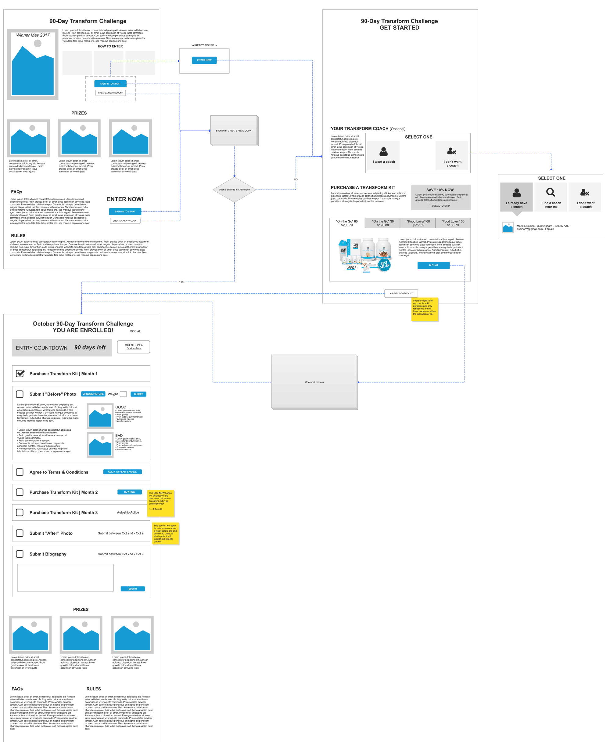
After initial discussion and sketch sessions with all the stake-holders, I produced this wireflow to illustrate the contestant's flow from the landing page, through sign-up, and ultimately onto their personal dashboard.
FINAL UI FLOW
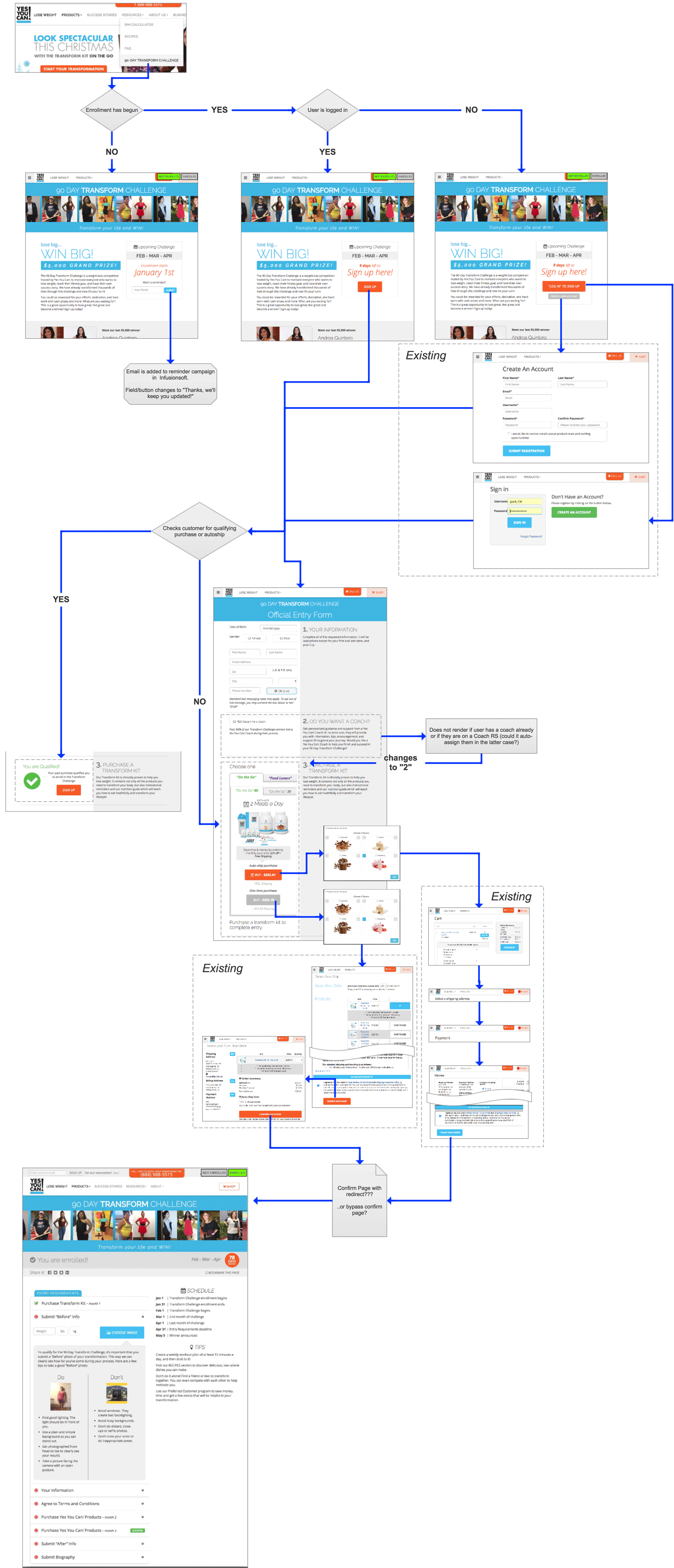

This was the user-flow chart I made for the final presentation of the system's functionality before development began. It details the entire entry process including parts of the existing site UI where login and the purchase is made. This was handed off to development team along with my HTML mock-ups and after a week and some testing we were ready to get people enrolling in our upcoming contest using the new system.
UI DESIGN
LANDING PAGE
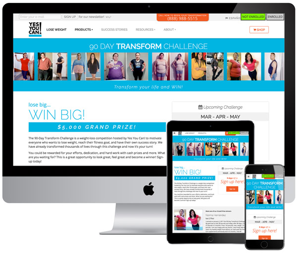
From the "Transform Challenge" navigation selection, users would and up on this page where the contest was explained and the latest winner would be featured. The header consists of a scrolling gallery of past winners to show potential contestants that many real people had accomplished great results.
This page would dynamically change based on a few factors:
Enrollment is not open - The sign up section would contain the date when enrollment begins and an email field for users to opt in for reminder emails regarding the start of the next contest period.
Enrollment is open - The sign up section would actually have two states, depending on if the user was signed in; if so it would simply be a sign up button which would lead to the enrollment page, otherwise the button would read "Log in to join" which would direct users to the log in page and upon successful log would end up on the enrollment page... or if they were already enrolled, the page would become their dashboard
User is logged in and enrolled - Before rendering, the landing page would check if the user was logged in, and if so, if they were already enrolled, the page would render as their contest dashboard (detailed later.)

ENROLLMENT PAGE
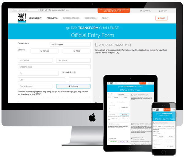
To increase enrollment I wanted to make the process as slippery as possible, so I distilled out only the most absolutely neccesary user input to include on this page. Then I broke the process into three steps:
Personal Information: This is a pretty straightforward form, and of course, if a user has already made a purchase, any existing information is pre-filled.
Coach Opt-in: This section originally was going to be much more complex and users were going to actually choose a "coach" (basically a local independent sales rep) but I made the case for simplifying this and again, getting just the most essential information, whether or not they wanted a coach or not.
"Transform Kit" Purchase: This section was challenging because it had to offer two types of kit, each with two sizes, each with two ways to purchase them; for a total of 8 prices and CTAs. I decided to organize things into a tabbed system which, of course, defaulted to our favored i.e. most expensive option. To distinguish the difference between the four products I wanted to be as succinct as possible so I once again distilled out each one's basic purpose of usage. "Replace 1 snack a day", "Replace 2 snacks a day","Replace 1 meal a day", "Replace 2 meals a day." Beyond that, only price, shipping fee, and product image differences are shown.

CONTESTANT DASHBOARD
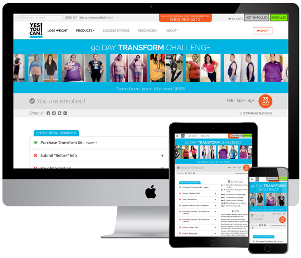
This page lives at the same URL as the landing page, meaning that if you are logged in and enrolled, all navigation to "Transform Challenge" lead to this, and users are spared all the marketing and sign-up CTAs (or worst of all, a redundant "I'm already enrolled" link)
Here are the main sections, and why they're there:
Before & After Pictures
The context relies around having before and after images of the contestants "transformation" and, after seeing several of the past entries, I decided to include a quick tutorial of what we were looking for.
Personal Information
Coming from the entry page, this information would be prefilled and so the section would be checked as complete. This section is where a contestant could change their information if required.
T&C Agreement
This is just a simple text area with a checkbox to indicate agreement. No "state saving" action is required, and the user is only made to check to box, which not only saves the agreement in their profile, but also closes the section.
Product Purchasing
This section is shown in it&srquo;s three possible states: #1 That month's qualifying purchase had been made; it's marked as complete. #2 That month's purchase has not been made. Users are given purchase CTAs for all the qualifying products similar to the contest entry UI.
Biography Submission
A simple text entry for with minimum character limitation to encourage contestants to write more in-depth stories.
