DIGITAL PRODUCT MANAGEMENT
DISCOVER
Gather as much data about everything as possible. Make connections. Form ideas about what it all means.
CONCOCT
Use the discovered information and ideas to create a vision of how to best meet the needs we’ve targeted.
BUILD
Mold everything into something real, step by step. Build in usage monitoring and gather more data. Go back to discover.
Hi, I’m John Cornelis Park...
good to meet you.
I am a certified AI & HCI Product Manager with coding, marketing and design chops. I think “big picture” and have an eagle-eye for detail in all stages of product development from need finding to product roll-out and refinement. I’m way into problem solving for effective, effortless UX and way NOT into ego and dogma. But enough about me, let's talk about your project!
Experienced
I’ve been creating well-thought-out on-screen experiences for over 15 years with a lust for innovating and growing.
Educated
Certified in AI & HCI, with a broad range of other media related education and a never-ending blogroll.
Empathetic
I wouldn't literally fit into most people’s shoes, but I can stand in them and think deeply about the needs and desires of others.
Entertaining
I take my work seriously, but not myself. I’ve been called wacky, funny, crazy... It’s all true.

E-commerce & MLM Site
UX Design
Responsive Web UI Design
Front-end Coding
Latin celebrity Alejandro Chaban's own line of diet shakes and weight loss supplements, with a newly introduced MLM system, ala Herbalife. This company's user base is over 80% mobile!
This was a small multi-national team working to develop three bilingual properties based on the Exigo platform: a consumer-facing e-commerce site, as well as a dashboard-style order/commission manager for independent sales representatives, and an internal administrative UI.
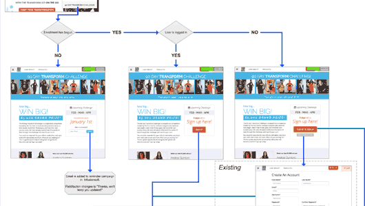
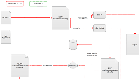
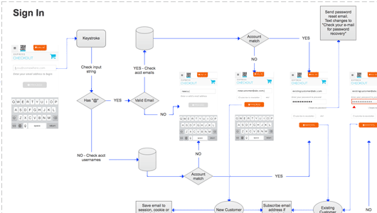
I worked closely with upper management, business analysts, and the development team on several projects to produce everything from early-stage UX architecture on through to fully coded mock-functional HTML/CSS/JS prototypes, and I assisted with subsequent user behavior analysis.
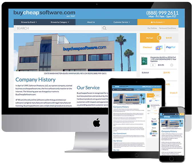

Ecommerce Site
Responsive Front-End Redesign
Sketch / PS / Axure / HTML-CSS-JS
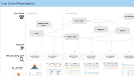
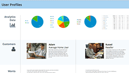
I managed this ground-up custom redesign project starting with user research by means of analytics, session recordings, and third-party ratings/survey systems on the existing site, as well as informal customer and staff interviews.
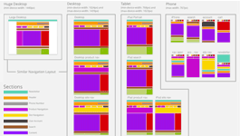
Based on findings made from that data, I redesigned the site framework (four level responsive) and key conversion processes, and directed the graphic redesign of the property’s look and feel.
After overseeing the initial front-end build, I managed and participated heavily in the development of the back-end, as well as making several front-end additions to the initial build.
Upon launch, the site exhibited improvements in all targeted metrics, as well as overwhelmingly positive customer feedback.
The success was unfortunately short lived as the company was involved in a lawsuit that forced it to shut down shortly after the launch of the new site.
DISCOVER
When I began at BuyCheapSoftware.com I discovered a ten year old custom made website. The e-commerce, product management, site search, pretty much everything had been built custom over the years, by several different developers. The front end was a primarily static, table-based monstrosity with hard coded headers and footers, since one of the top requirements was responsiveness, it was in the interest of the site’s maintainability to completely revamp the codebase.
The first thing I discovered once I dug into the analytics was that the site search exit rates were alarmingly high and there was nothing keeping track of the terms people were searching, so I implemented Nextopia site search to replace the existing search functionality, which managed to quickly drop the search page exits by a third.
The new site would take some time to develop so I mostly focused my attention on the existing site at first. This gave me the opportunity to immediately fix some critical issues, gather data about user behavior and opinions, and integrate some other third party systems including PayPal checkout and ResellerRatings. By the time I was ready to go full steam on the new site, I had boosted conversion rates from about 5% to well over 8%, reduced checkout abandonment from well over 6% to about 4%, and had a clear picture of what was working and what wasn’t.


CONCOCT
After poring over analytics and session recordings, outlining the owner’s vision, and gathering qualitative data from customers and staff, I began the concoction phase with these main objectives:
- Revamp the framework and styling of the front-end into something modern and mobile friendly, to encourage trust in the brand and website.
- Reduce clicks and page loads on the path to checkout to increase sales conversions.
- Introduce more product information into the lists of software titles to make browsing more glancable.
- Introduce site personalization features such as "saved addresses" to streamline the repeat customer UX.
- Add some other requested front-end features and integrate existing 3rd party APIs.
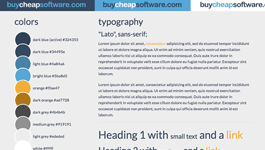
Once I was done with my sketches, notes, user flows, and wireframes I hired a local digital agency Analog Creative to work with me on the visual design. After a few rounds of iteration with the designer Cassy, we ended up with a contemporary UI which met all the objectives and looked great across devices. We called it v2.
During this time I also continued to update v1 with things like Google Trusted Store integration and a blog section. I implemented CPC campaigns and other marketing features which came and went through the site too, so I was still very active in v1's development as I managed the construction of v2.


BUILD
The initial code was produced by Brian at Analog using a Zurb Foundation 5 framework based on the mock-ups Cassy and I had come up with. After this hand-off I worked with a developer I hired, Kim, to build in all the functionality and complete some of the parts that were new or had otherwise been left out of the concoction phase.
Along the way, management decided to switch the payment processor so parts of the checkout process had to be rethought and tweaked. Although this held up production a bit, it set us up to be able to add the ability to save payment cards, a feature which would've been great but ultimately never saw the light of day.
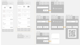
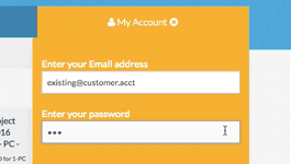
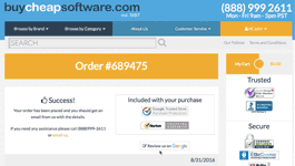
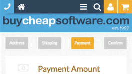
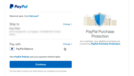
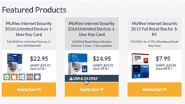
Below are pre-release screen captures of some of the key functionality of the site.


iPad/AppleWatch App Concept
Sketch / PS / Principle / AE
Expedia is in the unique position of knowing exactly where and when people are going to be. The concept of Metro Map is to extend Expedia.com's anemic “Things to do” section into a tool to facilitate the entire experience of trip planning and integrate seamlessly with the airfare and accommodation services already provided by them.
Metro Map addresses these types of interaction taking place during the travel process:
- City level exploration
You need to look for categories of things (e.g. museums, restaurants, music) within a specific geographic area. - Attraction Investigation
You need personalized info about the attraction and what people think of it to decide whether you want to visit it. - Scheduling an Agenda
As you decide on what to visit, you need to keep everything in one place with the ability to organize, and reorganize it at will. - Let's go!
Hit the town with your wearable discreetly keeping you on schedule and connected to the attractions you visit, and things close by. - Travel
Every flight/boat/train you've booked and hotel check-in/out are already part of your agenda and connected to local last-mile services.
The app could be used pre-travel to discover and plan for a visit to an unfamiliar city, and then act as a guide and itinerary once there. Location awareness would give the ability for the app to follow travelers every step of the way and bring awareness to details of the attractions and any other surrounding relevant information.
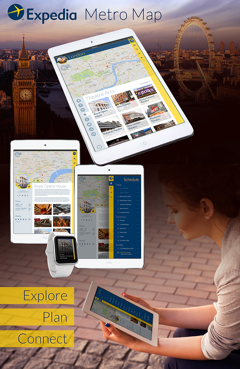
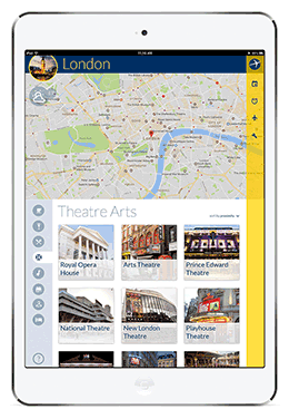
The city-wide interface groups attractions into categories that have been selected by the user (e.g. theatre arts, shopping, bars, etc.) and offers various sorting methods so for instance, when using the app on the go users could pull up the closest coffee shops.
A big map displays the attractions' locations and the location of the user if they are in the city. There is also weather information displayed which can be expanded out into a forecast view of the next few days.
Locations are shown from an exterior view in order to make the attraction easy to recognize once the user arrives there in person, and more information could be included overlaying the image (e.g. hours, prices, wi-fi availability, etc.)

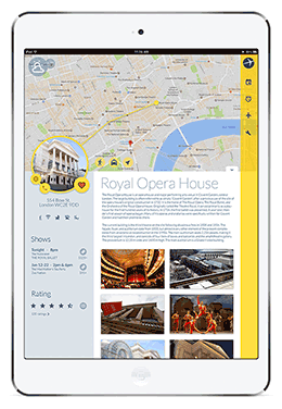
The details of an attraction include a text overview and web-sourced images for users to browse through. The map highlights the location and there are buttons to get directions or transportation to the address. The venue's contact information and web presence is clustered together, and below that all it's amenities/restrictins are listed. Other contextual information fills in the rest of the left column. In this case of a theatre, users can also check reviews/ratings and buy tickets from within the app.
If the user is interested in this attraction they can add it to their schedule, and then move on and continue exploring other things to do.

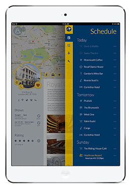
Within the main navigation of the app is the users schedule. This is an itinerary of attractions that they have compiled within the app along with any itinerary items they have created through Expedia's airfare and accommodations booking system.
Items can be moved within the list and are "greyed out" once the attraction has been visited. Micro-interactions such as rating an attraction can be made from the listing.
Since the app is connected to Expedia, all flight information changes can be pushed directly into the schedule.

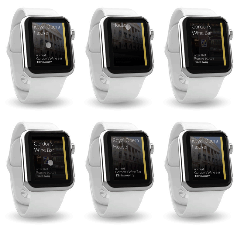
For smartphone wearers, there is an integrated wearable app. Keeping the iPad safe and concealed in a bag, the watch app gives access to the user’s schedule and information about the attractions. The app can navigate to the venues and, once visited, users can add thier rating/review.
All-in-all the user would never have to reference the iPad app once they had their schedule laid out.


Home Page Redesign
Sketch / PS
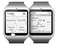
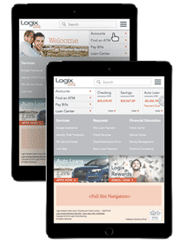
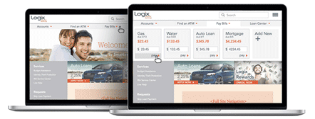
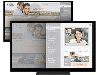
The Logix Federal Credit Union web site offers a lot of information and access to member's accounts. These concept mock-us demonstrate some ways in which to cram a bunch of menu options, while highlighting four commonly used functions (finding an ATM, accessing account information, paying bills, and contacting a support rep) and making them usable on the homepage itself, across a variety of devices.
A smartwatch size UI contains only the four predominant functions with a swipe-down menu into any other functionality. Finding an ATM on the go is a common use for any of the mobile UIs and using the the device's location and position awareness, the web site can generate a list of nearby ATMs and include the distance and direction to them.
Selecting a location from the list, users can pull the address up in their preferred mapping application.

On a tablet, members can access their account(s) quickly from the home page by selecting the "Accounts" button, which, instead of loading a new page with a list of their accounts, activates a panel which slides left over the hero image, pushing the navigation buttons over to the left side of the UI.
This panel scrolls horizontally to reveal tiles for each account with basic information displayed for each. Selecting a tile expands it to reveal more detailed information and buttons for common specific account interactions.

Paying bills on the laptop UI can be done painlessly from the home page. Selecting the tab from the main navigation activates a panel which slides down over the hero image and contains tiles for all the bills which the user has set up to pay.
The due amount and date is displayed and the amount is pre-populated so the member can just press "pay" and confirm. There is also the ability to add a new bill into the system.

On a large touch panel, members can get live technical support where they can video chat and share screens with a Logix representative. This allows the support staff to visually guide the member in their use of the site.


